Customize and style the “Add to Quote” and “Add to Basket” buttons to match your preferences.
Note:
By default, the Quick Quote Basket button is automatically placed below the Add to Cart button on the product detail page. If you want to rearrange its position or if the button doesn’t appear, you can configure it manually. Please check this link to further know about the configuration briefly: Read more
Display Buttons #
This setting allows you to choose which button(s) will appear on your product pages. You can select one or both options based on your store’s needs:
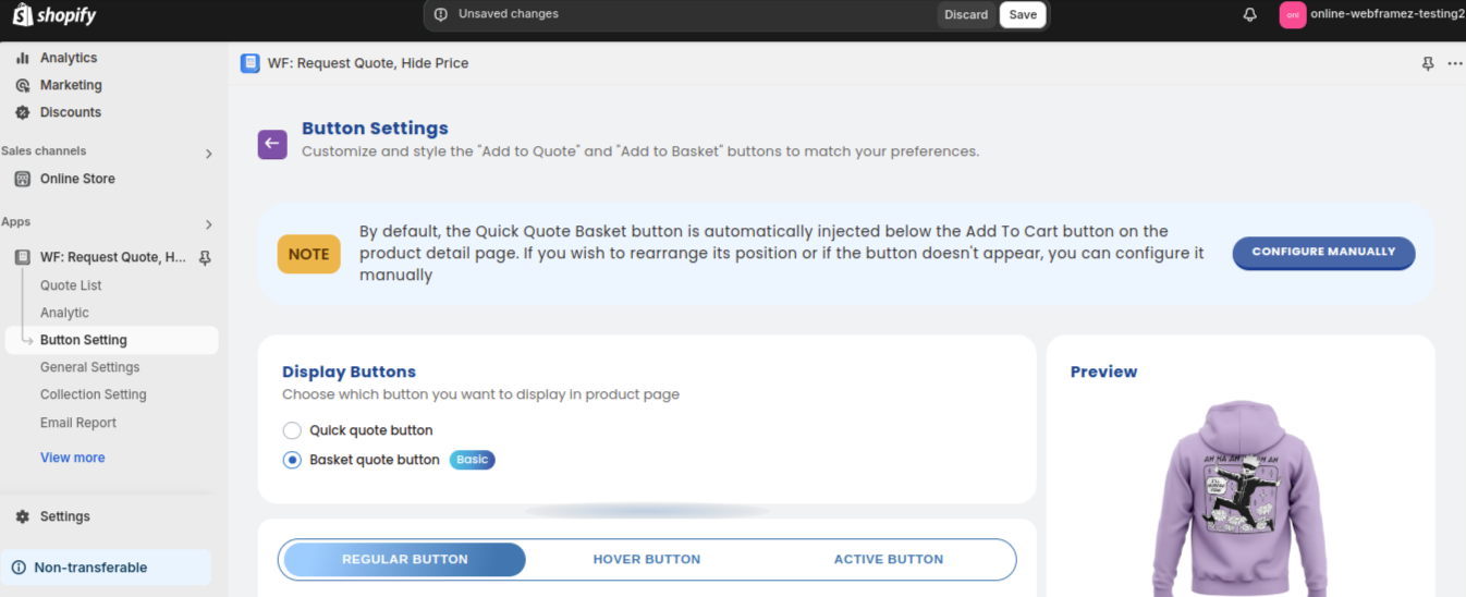
- Quick Quote Button:
Displays a button that allows customers to request a personalized quote for a product. Clicking this button will prompt customers to fill out a quote request form, making it easy for them to inquire about specific pricing or deals. Read more - Basket Quote Button:
This button allows customers to add multiple items to their quote basket. It’s ideal for customers who are interested in receiving a quote for more than one product at a time. When they’re ready, they can submit the entire basket for a tailored quote : Read more
Button States: Regular, Hover, and Active (Note : If you choose it as a quick button only regular and hover option will be available) #
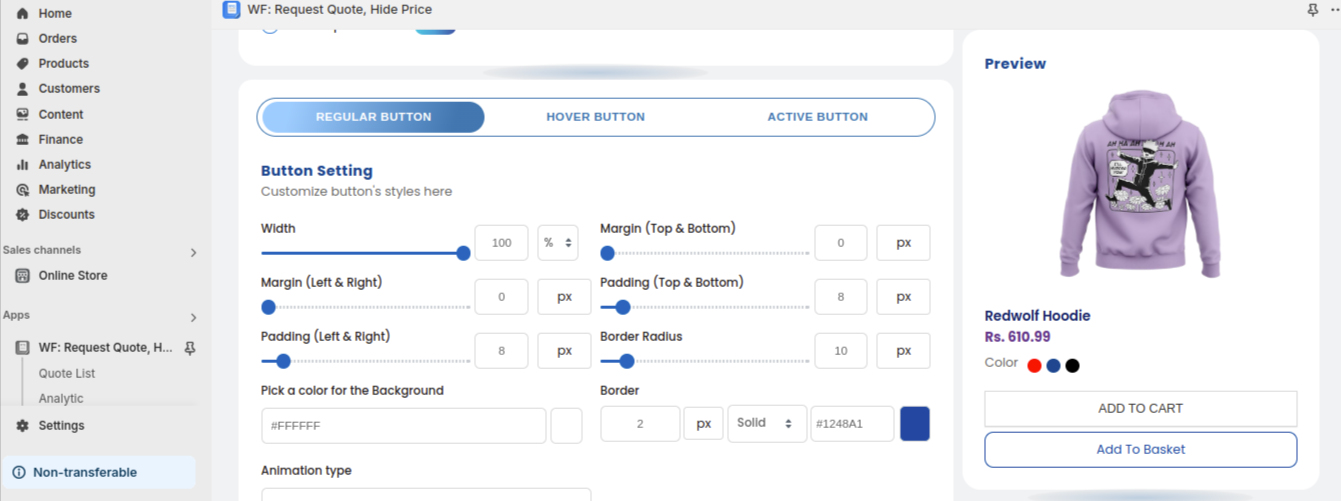
These states allow you to customize how the button appears in different user interactions. #
- Regular State:
This is the default appearance of the button when it is not being interacted with. You can customize the background color, text color, and other styles that users will see initially. - Hover State:
The hover state refers to the appearance of the button when a user hovers their cursor over it. You can set a different background color, text color, or add effects to make the button visually interactive when users are about to click. - Active State:
The active state is the appearance of the button when it’s clicked or being pressed. This is the state where you can adjust the button’s styling to show feedback when the user has engaged with it (e.g., changing its color, adding shadows, etc.).
Button Styling #
Adjust the button’s appearance to match your store design:
- Width: Set the width of the button (as a percentage or fixed size).
- Margin (Top & Bottom): Control the spacing above and below the button.
- Margin (Left & Right): Adjust the spacing on the left and right sides of the button.
- Padding (Top & Bottom): Set the internal space above and below the text inside the button.
- Padding (Left & Right): Control the internal space on the left and right sides of the button’s text.
- Border Radius: Round the corners of the button to give it a softer look.
- Background Color: Choose the button’s background color to match your store’s theme.
- Border: Adjust the border width and style (solid or dashed).
- Animation Type: Choose an animation style for button interaction (e.g., none, hover effects).
Text Settings
#
Customize the text style for your button label:
- Font Family: Choose the font type for the button text.
- Text Align: Set the alignment of the text (left, center, right).
- Font Style: Apply italics, bold, or other styles to the text.
- Text Decoration: Add underlines or strikethroughs to the text if needed.
- Text Transform: Adjust text to uppercase, lowercase, or capitalize.
- Font Size: Control the size of the text in the button.
- Text Color: Select the color of the text to make it stand out.
- Font Weight: Set the thickness of the text (normal, bold, etc.).
Let’s see how we can change the buttons display in the admin side and how it reflects on the front end :


