The WF: Request Quote, Hide Price app allows you to personalize the collection icon or button to enhance customer engagement and improve your store’s design. This section covers how to customize and display the collection icon/button on your collection, search, or catalog pages.
Show Collection Icon/Button #
You have the option to display a collection icon or button on your pages. You can choose whether to show it or not on the collection, search, or catalog pages.
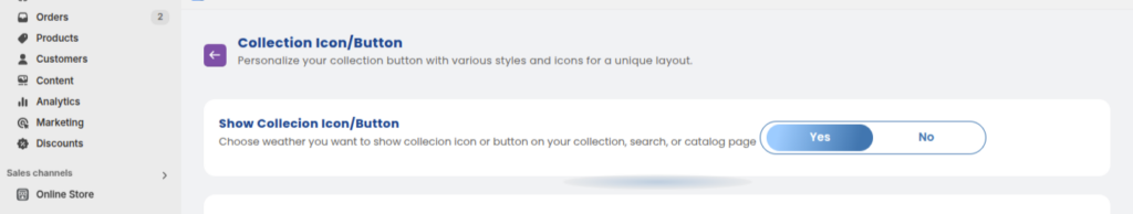
- Yes: Display the collection icon or button.
- No: Do not display the collection icon or button.
Icon or Button #
You can choose between displaying an icon or button for the quote request. Both options provide a quick way for customers to interact and request quotes.
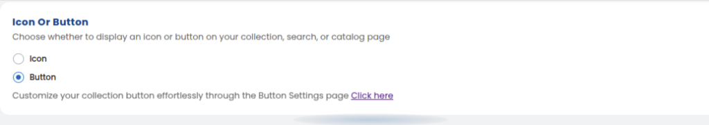
- Icon: A small visual element representing the quote request.
- Button: A clickable button to initiate the quote request.
Customize Your Collection Button #
To personalize your collection button, you can access the Button Settings page in the app. This allows you to easily adjust the button’s design to match your store’s layout.
Choose Your Collection Icon
#

You can select the perfect icon to represent the quote request on your collection or home page. Choose from a variety of icons, such as the heart icon or others.
Icon Position and Size
#
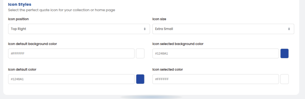
Adjust the position and size of the icon to fit your design:
- Icon Position: Set the position to Top Right.
- Icon Size: Choose the icon size (e.g., Extra Small).
Icon Background and Color Customization #
You can change the background and color of the icon in both its default and selected states. This allows you to create a visually appealing and branded look for your icon.
- Icon Default Background Color: Choose the background color when the icon is in its default state.
- Icon Selected Background Color: Choose the background color when the icon is selected.
- Icon Default Color: Set the default color of the icon when not selected.
- Icon Selected Color: Set the color of the icon when selected.
Adding an Icon or Button to Your Collection and Home Pages #
You can easily add the icon or button to your collection and home pages by inserting the appropriate code into the card-product.liquid file.
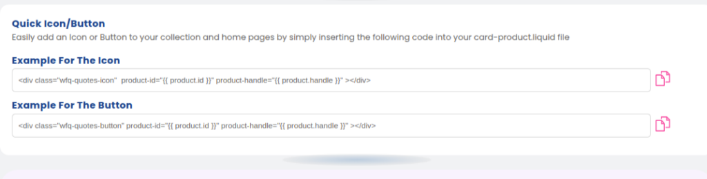
Example Code for Icon: #
<div class=”wfq-quotes-icon” product-id=”{{ product.id }}” product-handle=”{{ product.handle }}”></div>
Example Code for Button: #
<div class=”wfq-quotes-button” product-id=”{{ product.id }}” product-handle=”{{ product.handle }}”></div>
Quick Reference #
Use the provided code snippets to add the icon or button to your product pages.
By following these steps, you can provide a personalized and functional quote request option that fits seamlessly into your store’s design.


